Brands are tricky things. They are challenging to build and very easy to destroy. It takes a long time to create a great one, a considerable amount of patience, and often enough a similar amount of money.
For all the effort marketers put into building brands, the funny thing is we don’t control how you feel. A brand is only as good as a customers’ last experience. Think about the last “big brand” company you interacted with. How do you feel about them? Hopefully great, but often enough, not so much. Brands are, basically, built on trust.
When I joined ZAG in early 2020 as their marketing director, one task I needed to address was the company’s brand. I wanted to capture what inspired me to join the business. It wasn’t just the professionalism and integrity of the people I met. It was also that everyone at ZAG so passionately lived the company’s mission of “enabling our clients to succeed.” If we fail, things go very wrong for our clients. Trust is a big deal here.
Since brands are easy to break, I’d like to share my approach to ZAG’s brand and branding more generally. In this post, I’ll discuss our visual brand.
As mentioned, brands take a long time to build. We can shorten the time to success by investing (usually) very large amounts of cash. The first thing I needed to consider was the company’s marketing reality: did we have time on our side, or an untapped well of money? Like most SMEs, we have more time than money. Which means a “brand refresh” rather than a complete rebrand.
Logos & car bumpers
As you can see below, the logo I inherited was more like a banner than a logo. It clearly states the company’s name and mission, but there isn’t anything identifiable that anchors your eye. It doesn’t pass the car bumper test.
![]()
Car bumper test what? Imagine you’re driving down a busy highway at 65 miles per hour, and you check the oncoming traffic. Cars are zooming by. You catch the grill of a passing vehicle and notice the emblem on the front. Is it a Ferrari? Honda? Tesla? GMC? Better than even chance, you know the car’s brand more often than not.
That’s the bumper test. Can I create a logomark that over time and with enough investment could be clearly identified if it were on the grill of a car doing 65 mph in the opposite direction? Here’s where we landed:
![]()
Sometimes life gives you a gift. This logomark was a work in progress started by our sales director before I joined the company. It instinctively felt right. It captured so much about ZAG’s truth.
About Hexagons
We have a belief in the interconnected nature of our relationship with our clients. The hexagon, which you’ll see in our honeycomb theme on this site and elsewhere, shows strength and connection. Our team, from systems architects to engineers, project managers and procurement lifecycle managers, to the technology strategy group, all add value to client relationships. It’s our approach to “surrounding the client” with a breadth of solutions to solve their biggest challenges.
Whitespace
The whitespace in the logomark design reflects forward momentum and growth. This is true for us as a business, and it’s true for our clients. It also maps to ZAG’s vision that technology is a competitive advantage for our clients. The ability to think ahead, to build systems that give CEOs and CFOs flexibility, business intelligence, that allow them to grow their business with confidence is a huge competitive advantage today.
ZAG in the hex?
There’s a running joke inside the company that depending on how you look at the logomark, one can see the word “ZAG.” It’s funny watching people contort themselves inside out to find it. When I mentioned it to our CEO Greg Gatzke in a marketing meeting, he looked at me and said, “Well, Rob, we are in California, and you must be on drugs.” The room erupted into laughter, me included. ZAG is the kind of company where we take our clients’ work seriously, ourselves not so much. Anyhow, maybe you can see ZAG in the hex.
Logo font and wordmark
Once we locked in the logomark, the remainder of the logo followed naturally. We changed the font, but even then, one quite similar to the legacy font. We strengthened the presence of the company name ZAG in the logo and slightly diminished the words “Technical Services.”
![]()
The reason for deemphasizing Technical Services is fundamental to how I approach marketing. ZAG is an IT consulting services business. We have deep expertise in helping our clients create a competitive advantage through technology. Technical services are what we do, not the value we deliver. When people think of ZAG, I want them to focus not on what we do but why they should care.
Marketing is never about us and is always about how we serve our “audience.”
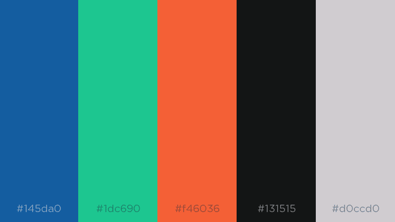
Brand Colors
Blue and green. Seem to go well together. I didn’t see much point in changing the existing color palette. It’s even more time consuming than creating a logomark. Instead, we “refreshed” the color palette with slightly more modern hues of our primary blue and secondary green. We also added orange as a tertiary color, which serves so many purposes well. We also formalized black and gray.
Integrating the Brand
With the brand refresh complete, we were then able to commence work on several projects to elevate ZAG’s presence in the market. From our new website to social media graphics to letterheads (yes, they’re still a thing even if digital).
Ultimately, the brand refresh is about modernizing ZAG’s profile while delivering consistency across all touchpoints.
I’m happy that we landed in the right place. A refresh rather than a total rebrand was the right move. An update is a relatively lightweight activity. It isn’t financially costly, is relatively easy to get over the line with the executive team, and can be delivered very quickly. In times of uncertainty, velocity always wins.